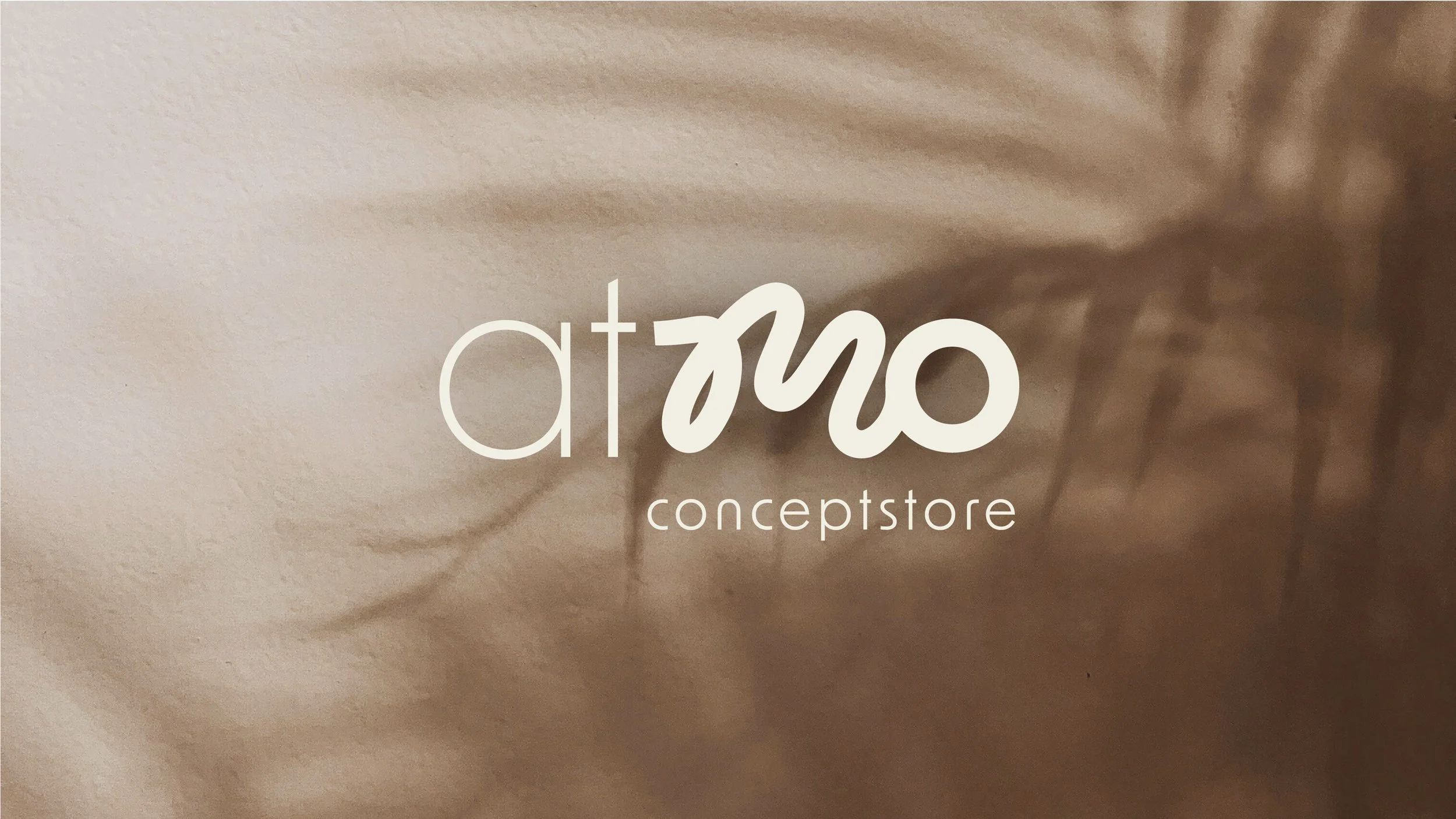
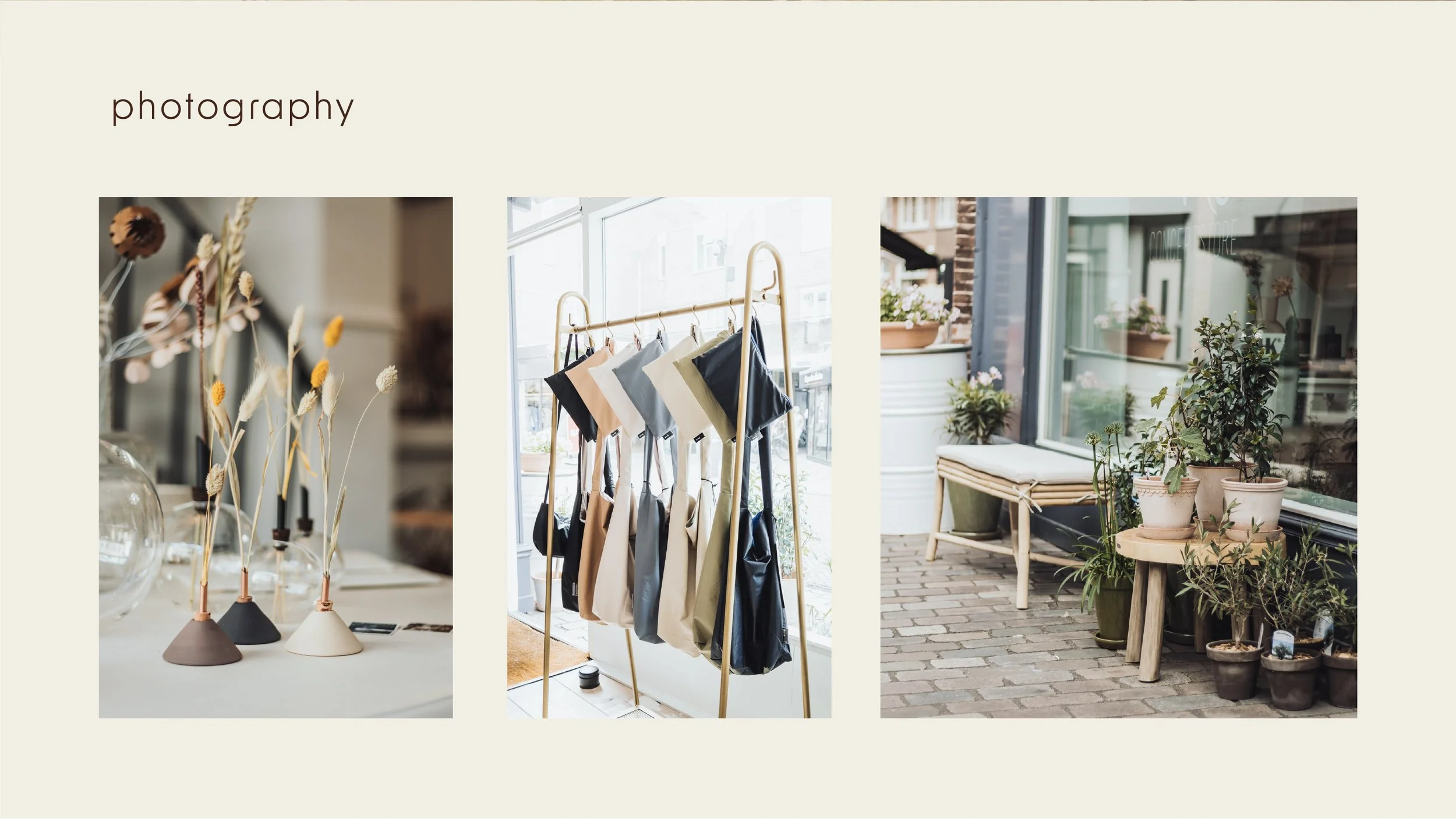
Atmo Conceptstore
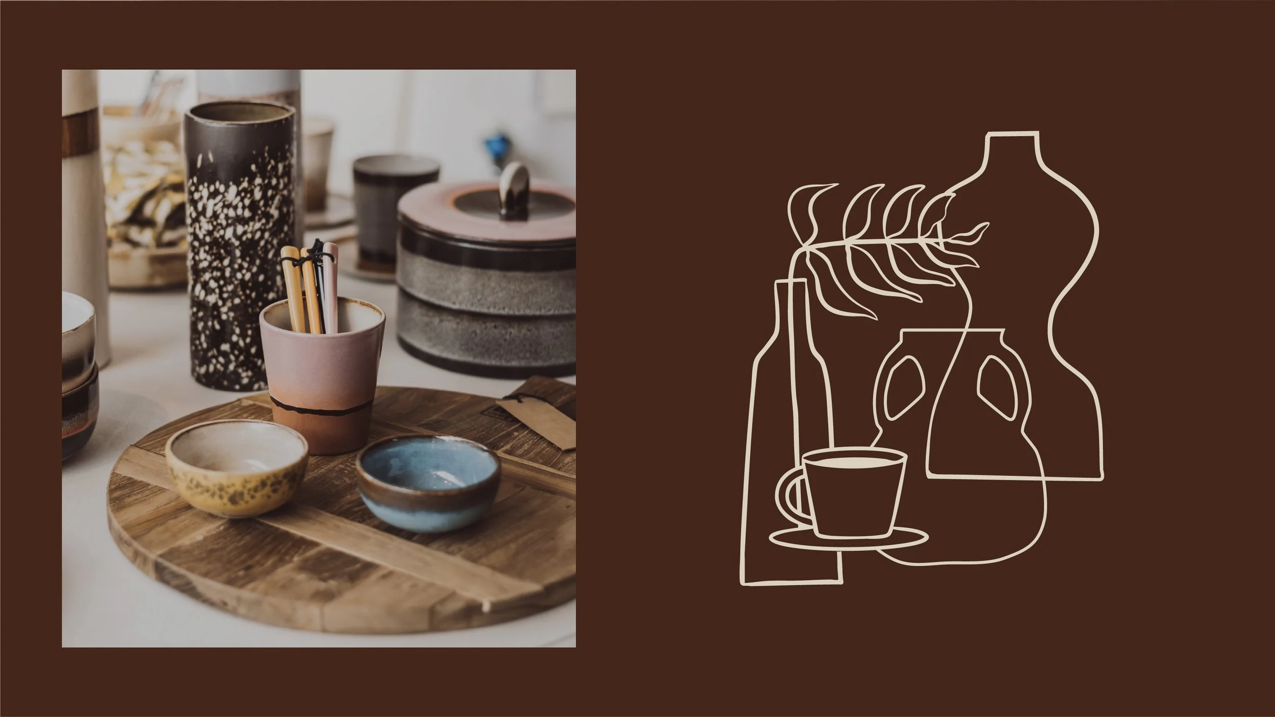
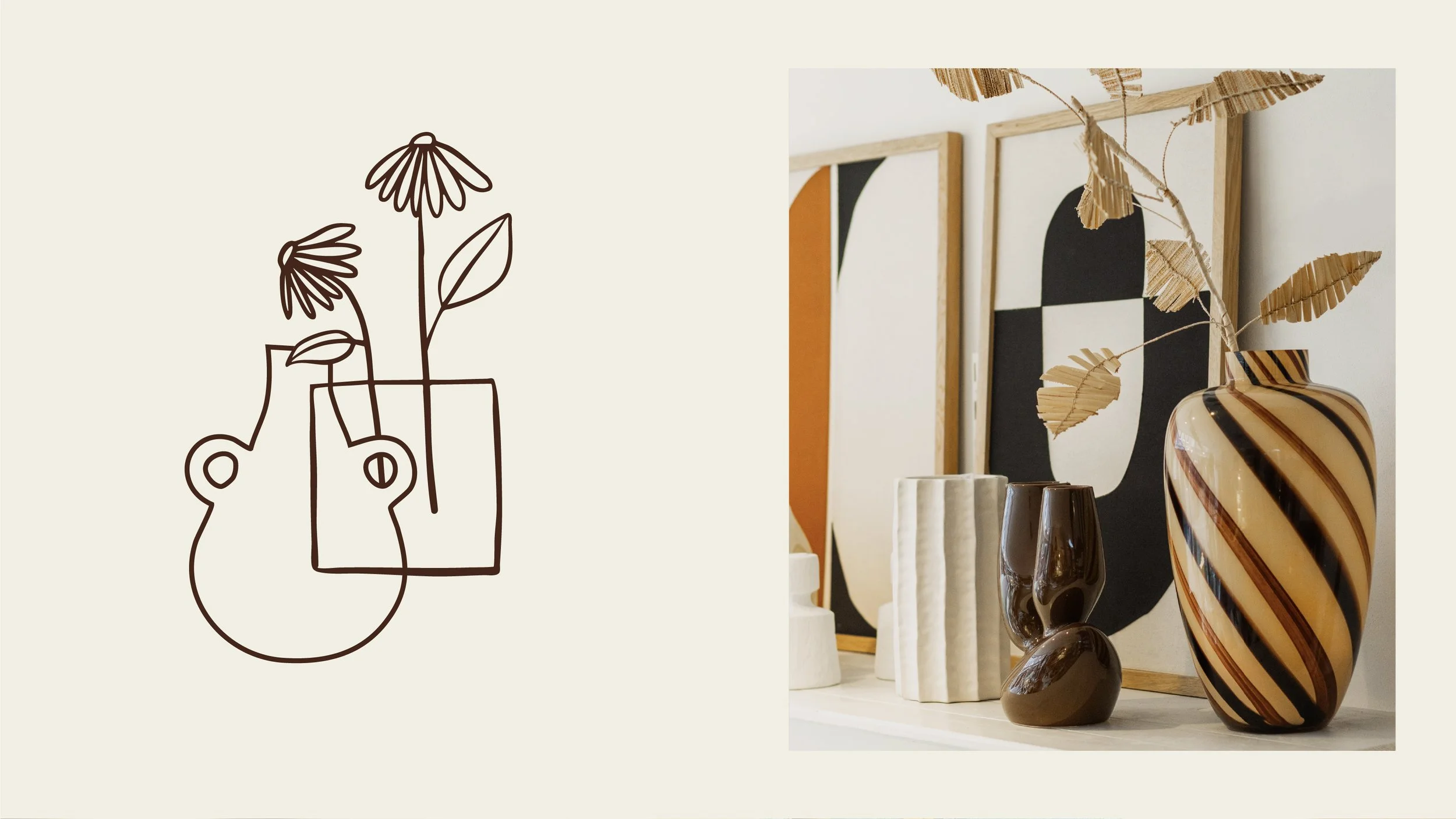
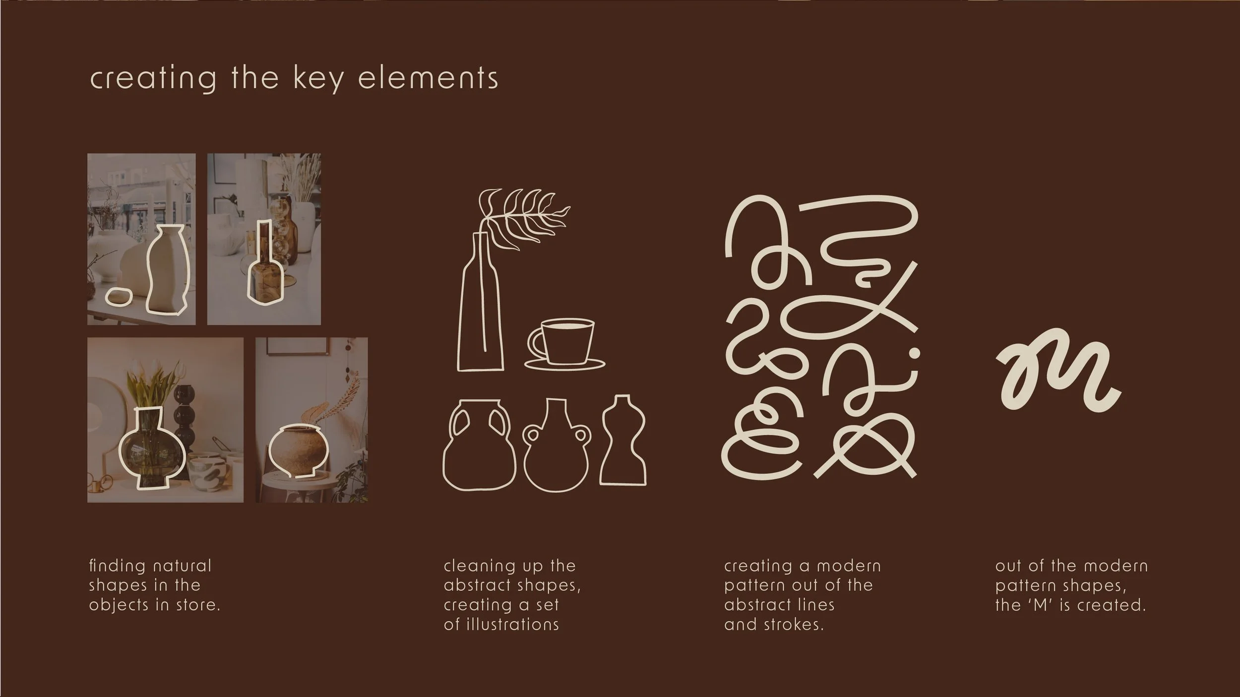
For the new branding of AtMo Conceptstore, I wanted to create a fresh, modern look while keeping the personal feel of the store. I started by making line drawings inspired by shapes and details from the shop. These drawings became simple, flexible illustrations that can be combined in different ways, adding a unique touch to the brand.
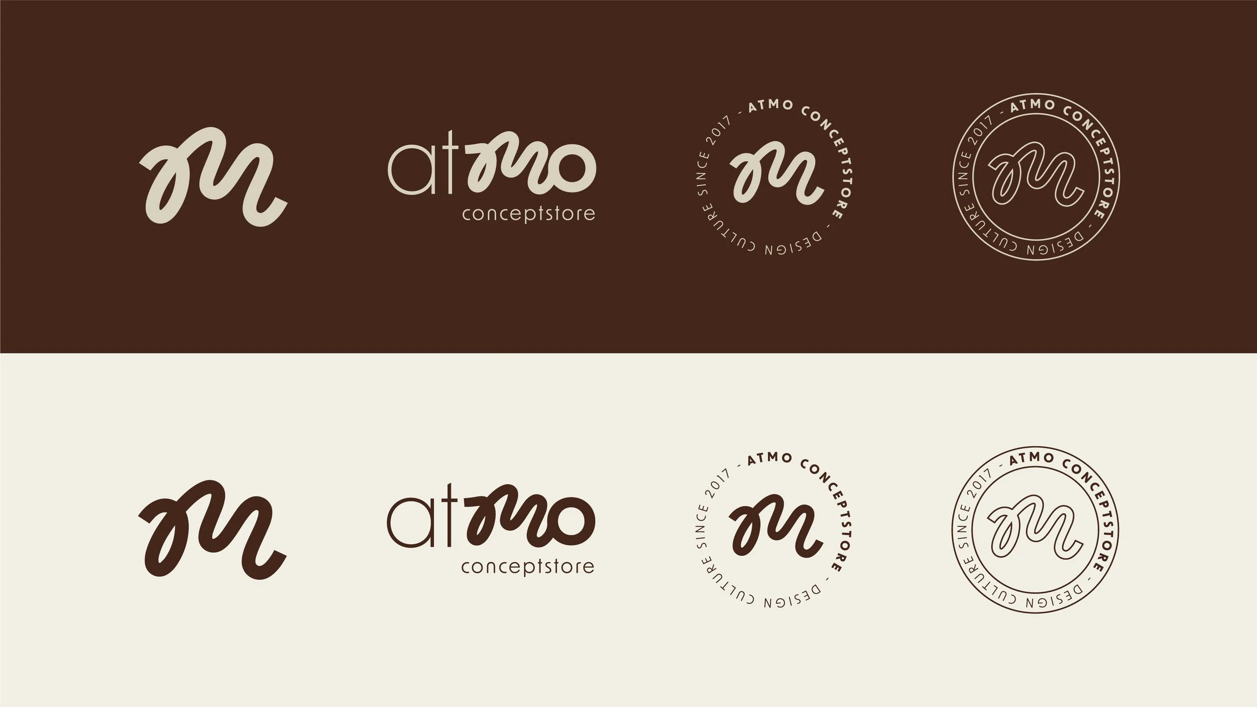
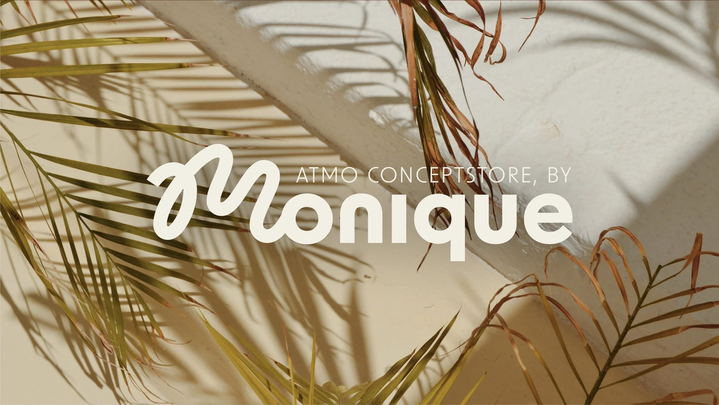
The new logo follows the same idea. It’s a mix of light and bold weights in a clean, modern font—sleek but still warm. AtMo Conceptstore is personal, run by Monique, so we wanted to keep a bit of that personal touch from the old logo. That’s why we redesigned the handwritten ‘M’ into a neater, more refined version. This way, the logo still feels familiar but fits the new, timeless look.
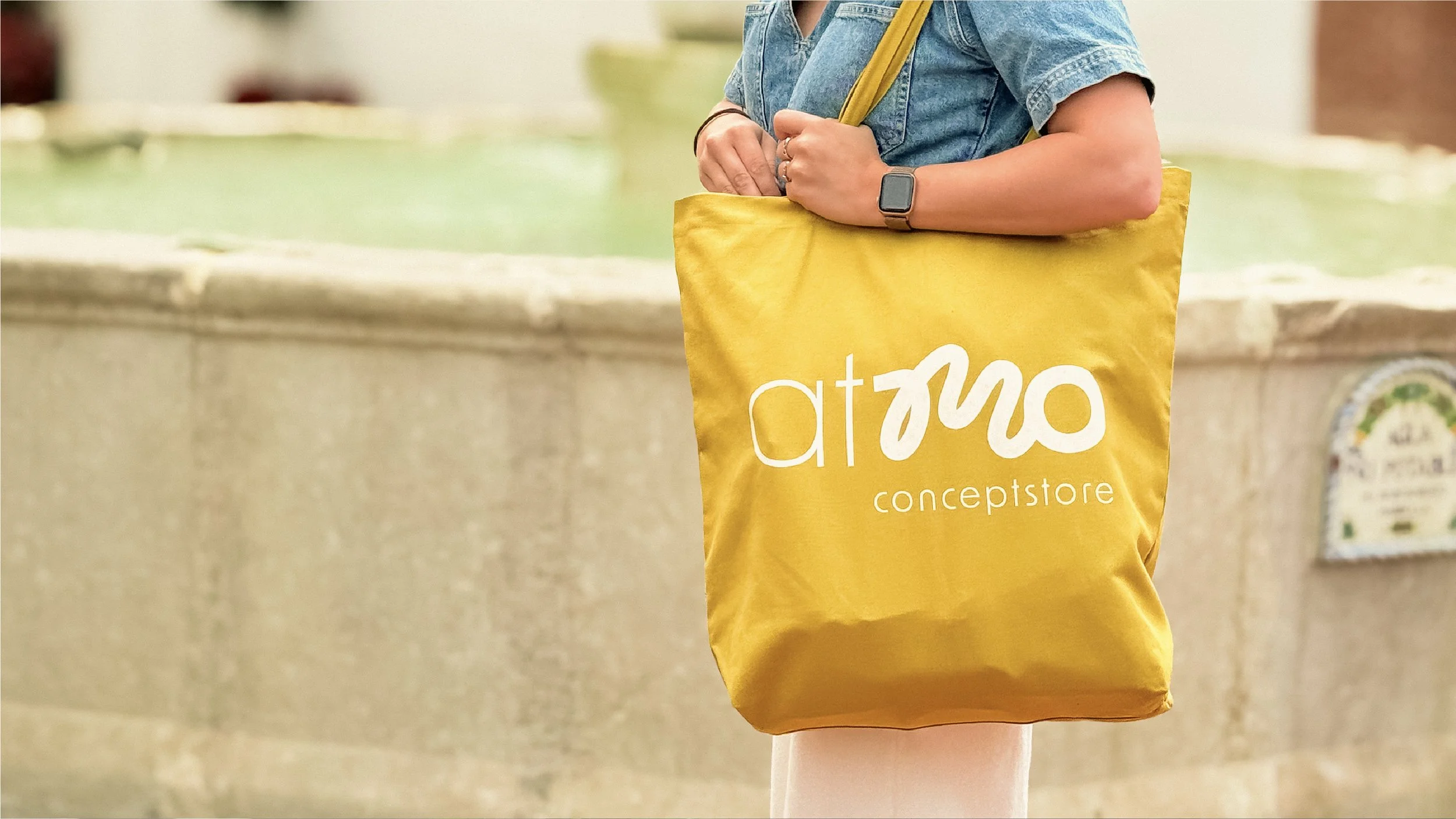
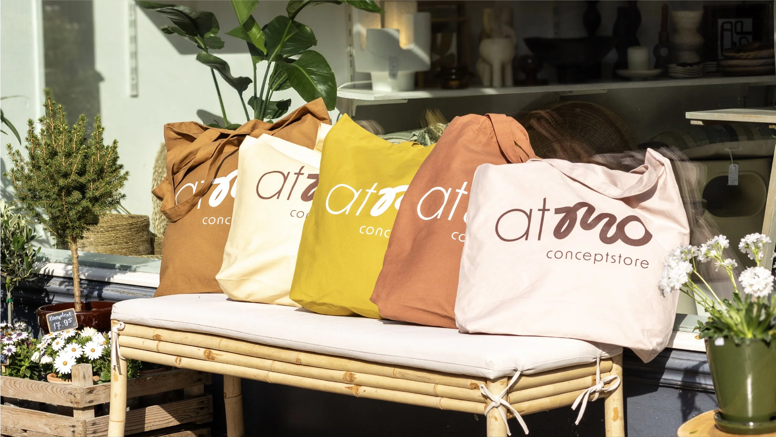
To bring the branding to life, I also designed tote bags with the new logo. Now, AtMo Conceptstore has a fresh identity that feels both modern and personal, just like the store itself.