GP Dressage
For this graphic design project, I developed a logo and a corresponding mini brand identity. When clients ask for just a logo, I find it a bit limiting. I am very visually driven, and I always start my projects by seeking a mood, creating a mood board, and capturing a particular atmosphere. From there, I dive into the design process.
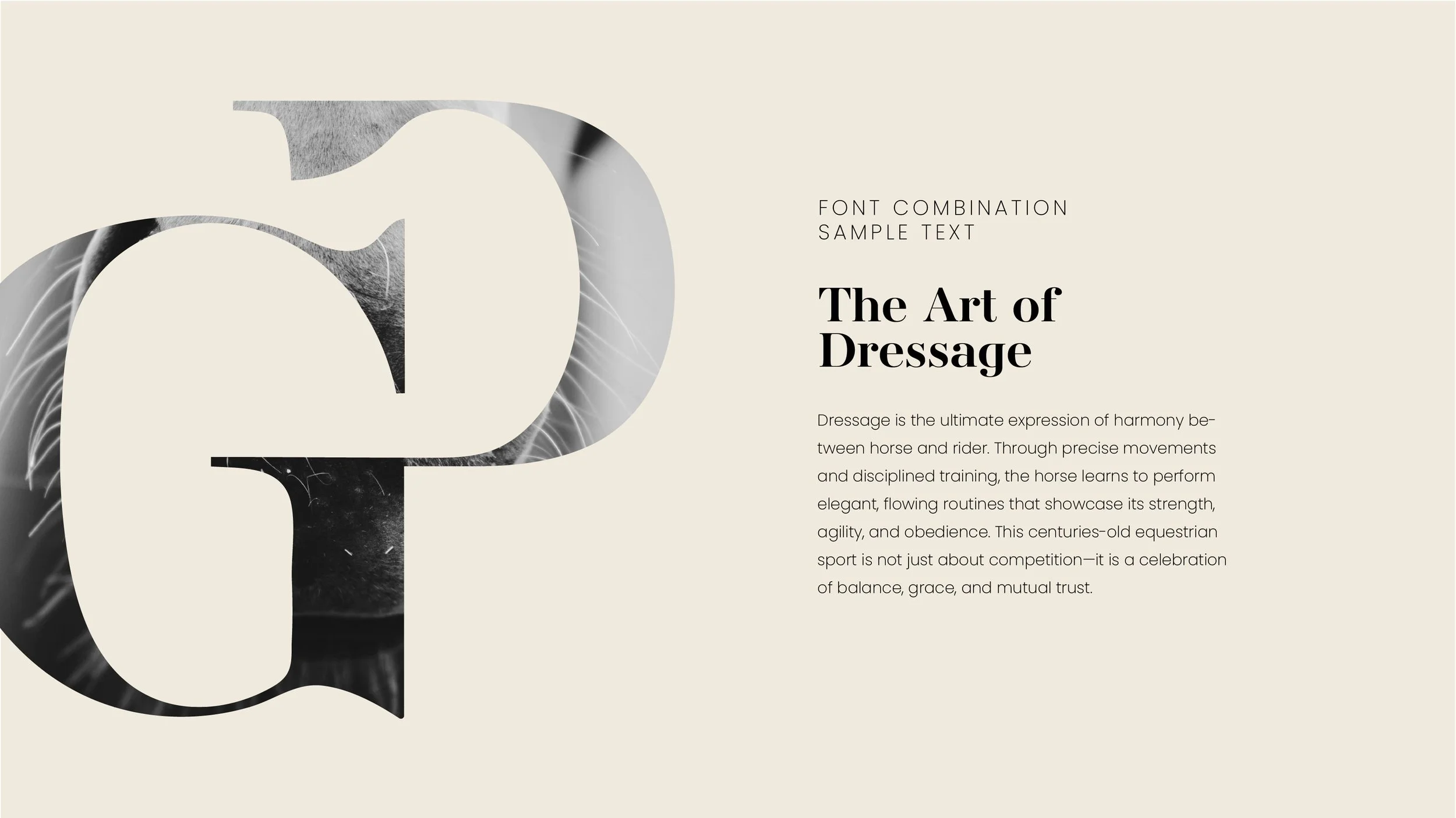
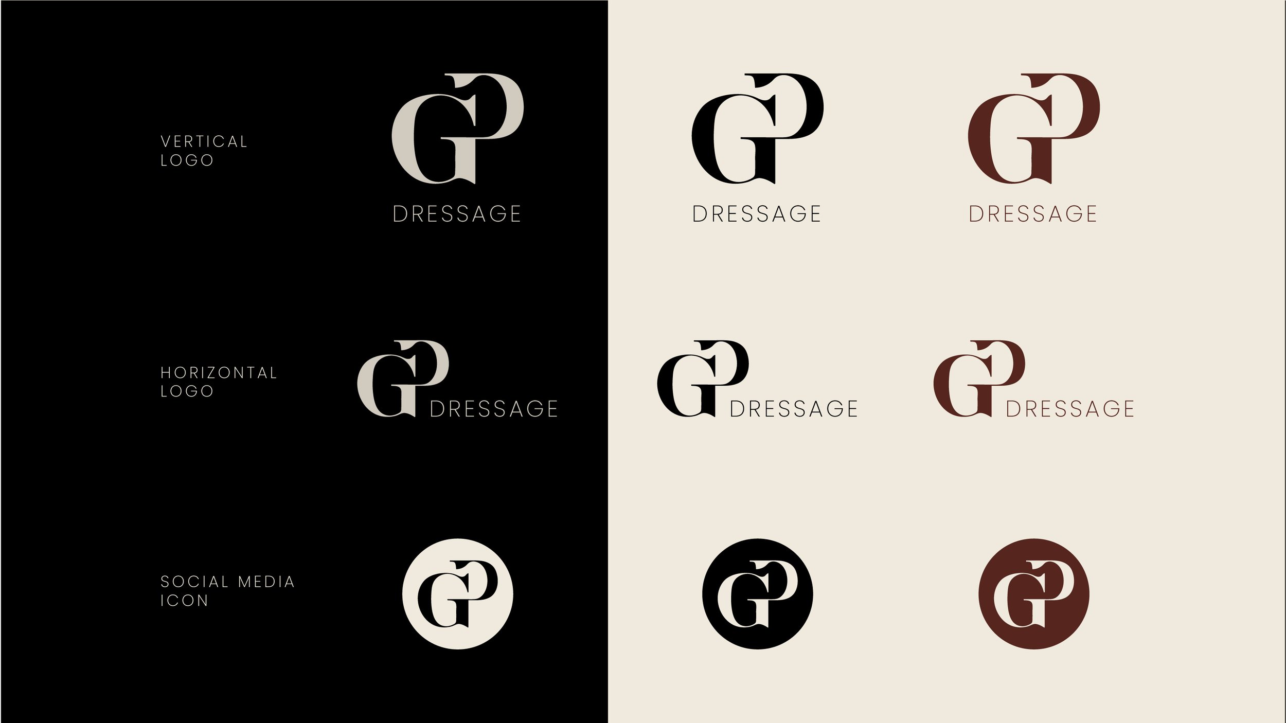
The task in this case was to create a logo for GP Dressage, a new business that had no visual identity yet. It was a blank canvas, and I absolutely love that—there are no influences from existing designs or other elements to worry about. The logo itself was created by merging the letters G and P, as per the client's request, with a clean and minimalist approach.
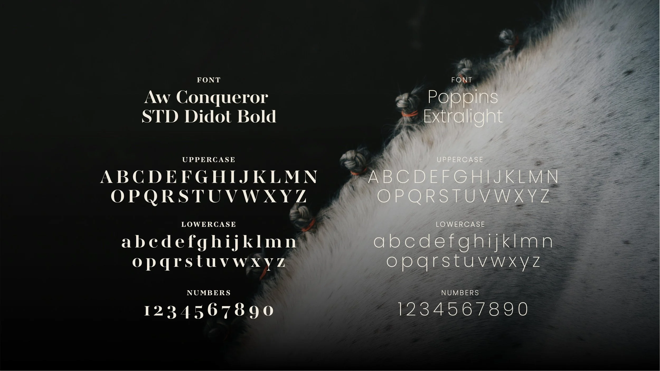
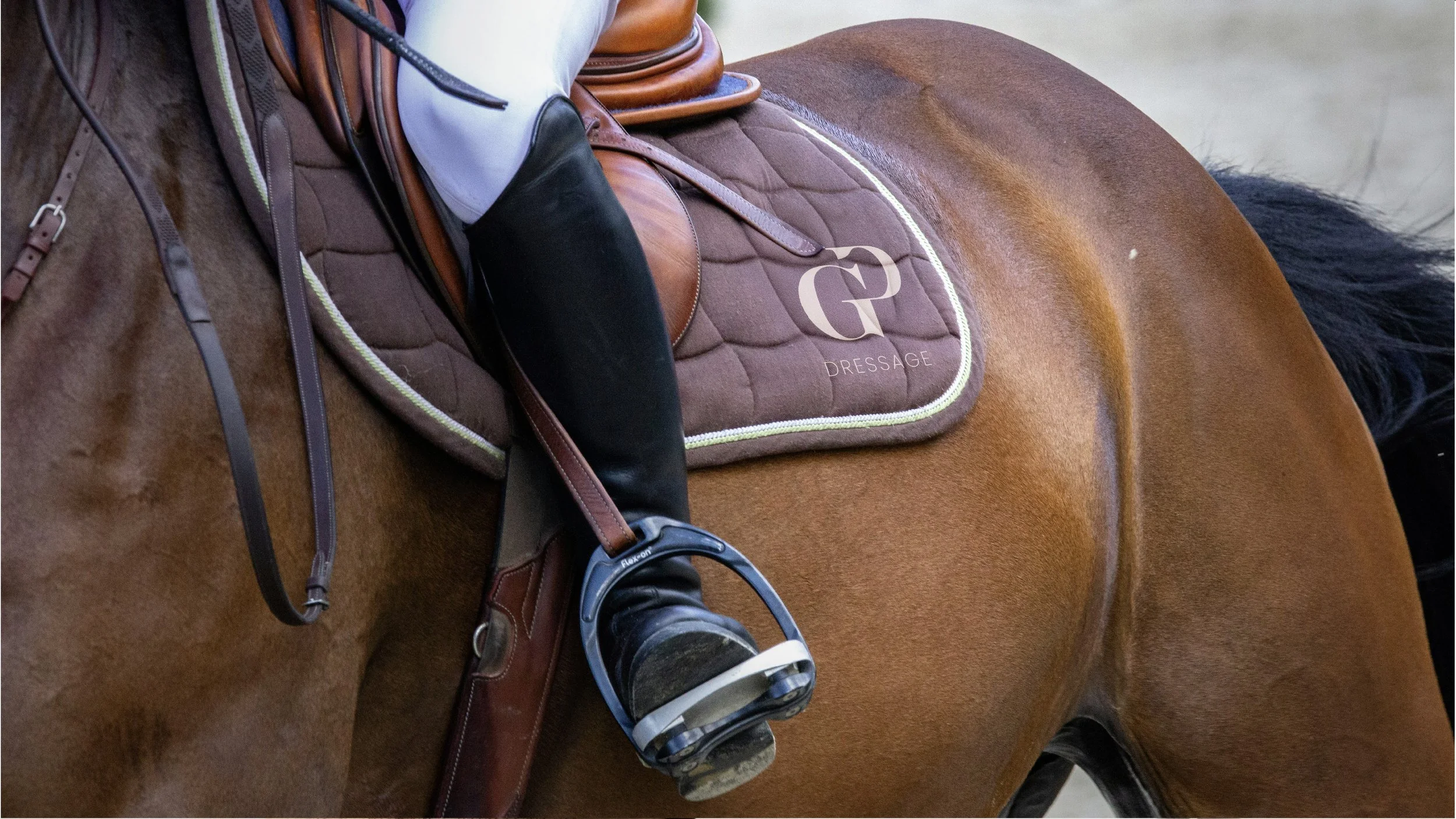
The mini brand identity I created alongside the logo includes the typography used for the logo and an additional element that flows directly from the logo itself. This element serves to tie the whole brand identity together in a cohesive and memorable way. It's about creating something that feels both unique and functional, all while staying true to the essence of the brand.